client
Nexity E-gérance
Nexity E-gérance
UX Research
Interaction Design
Visual Design
12.2016-01.2017 (3 weeks)
Initiated by Nexity, one of the leaders in the French property management market over 30 years, E-gérance is a digital platform that helps landlords manage their rental properties effortlessly.
One year after its first launch at the end of 2015, E-gérance found:
“The current sign up flow and the visual hierarchy of the current dashboard are unclear, which often got users frustrated and even overwhelmed platform manager with inquiries.”
Therefore, E-gérance approached us for design solutions to enhance user experiences.
Clients first presented content, design, and functions audit in the workshop, outlining problems users encountered with the current platform.
Secondly, we worked collaboratively to define and prioritize issues to solve as follows:
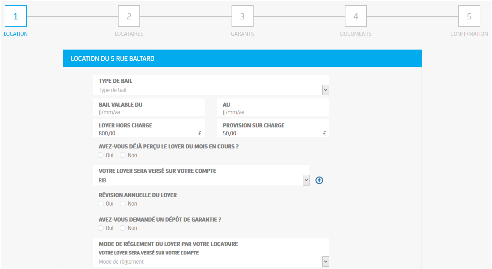
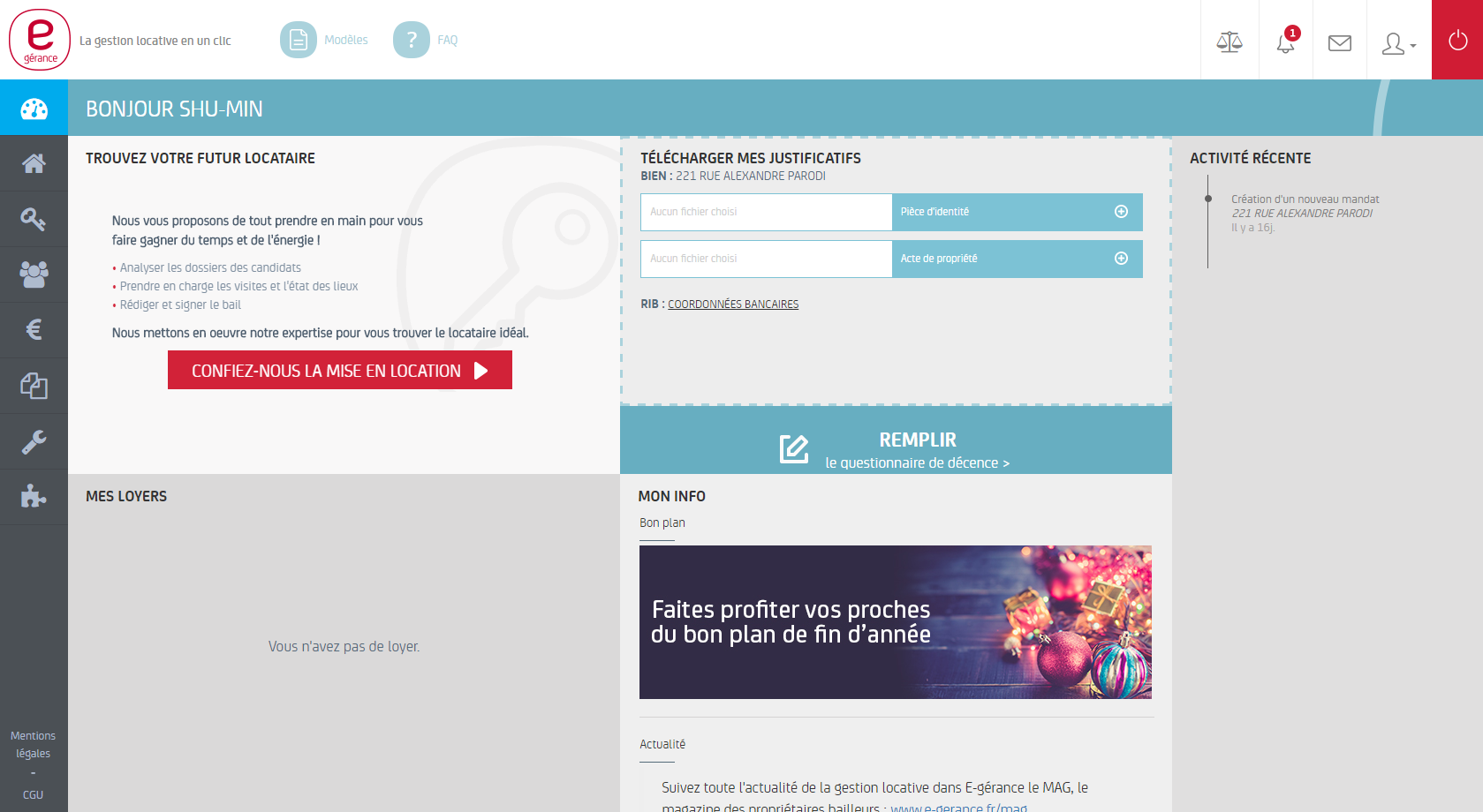
Below are previous RAR flow and dashboard
Due to the clients’ priorities and budget, here we’ll discuss only on issue 1:
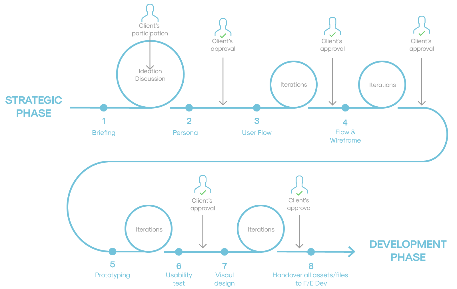
The design process of this project can be illustrated in the following graph. I led the process from step 2 to 8, making the design deliverables while communicating internally with PM and developers and externally with the client.
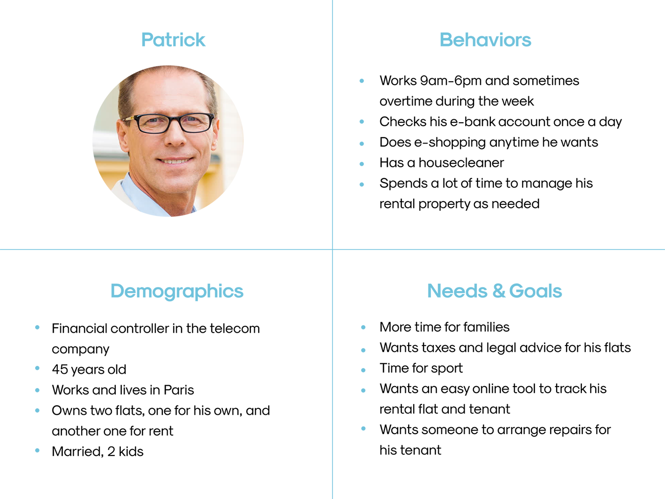
To start off, I created a provisional persona of a potential E-gérance user based on online user feedbacks and demographic statistics we had from real users data to cover the hypothesized customer: A middle-aged male professional with middle or high income.
I examined e-banking, e-commerce, real estate and insurance websites to find design patterns and language that E-gérance customers may already be familiar with.
I found:
After an internal meeting with PM and technical Lead, we decide to take the design direction close to “e-banking” and “vacation rental-based” sites.
Based on the persona and research, the updated user flow was created to demonstrate the main structure of the process. The client and technical professionals were closely involved in this stage to make sure all stakeholders are on the same page about the scope and feasibility of the proposed features.
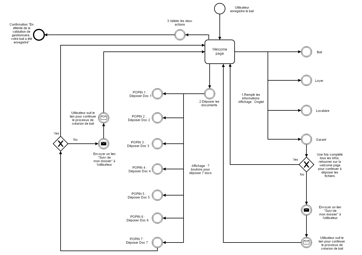
Before designing, we developed several UX guidelines that we would use to guide our design decisions. The guidelines outlined the overall structure and features that we would use to help make it easier for users to fill out their RAR forms.
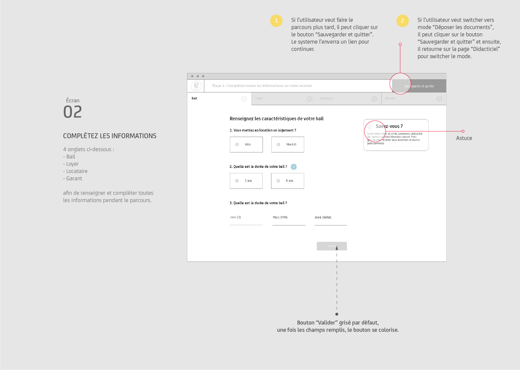
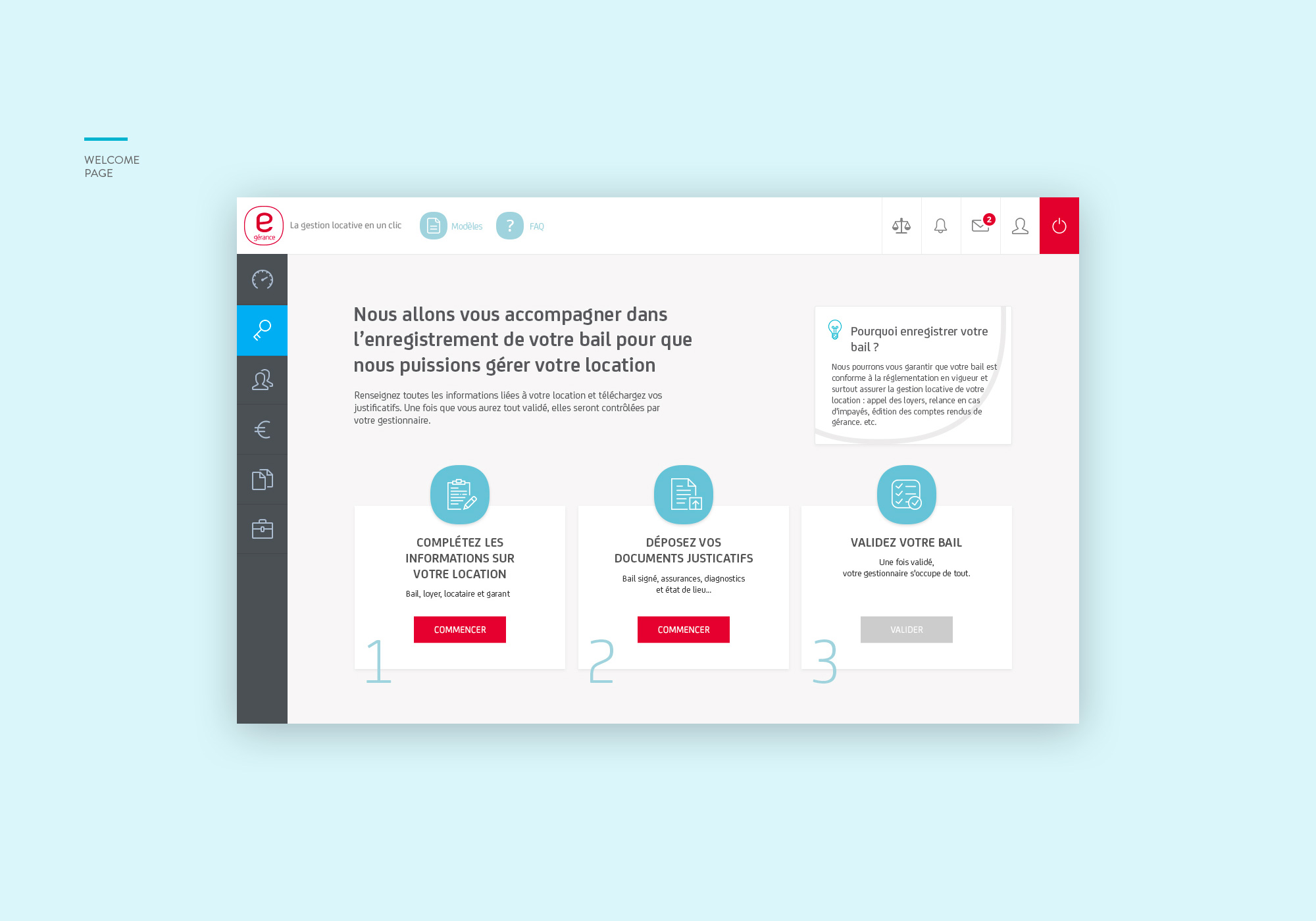
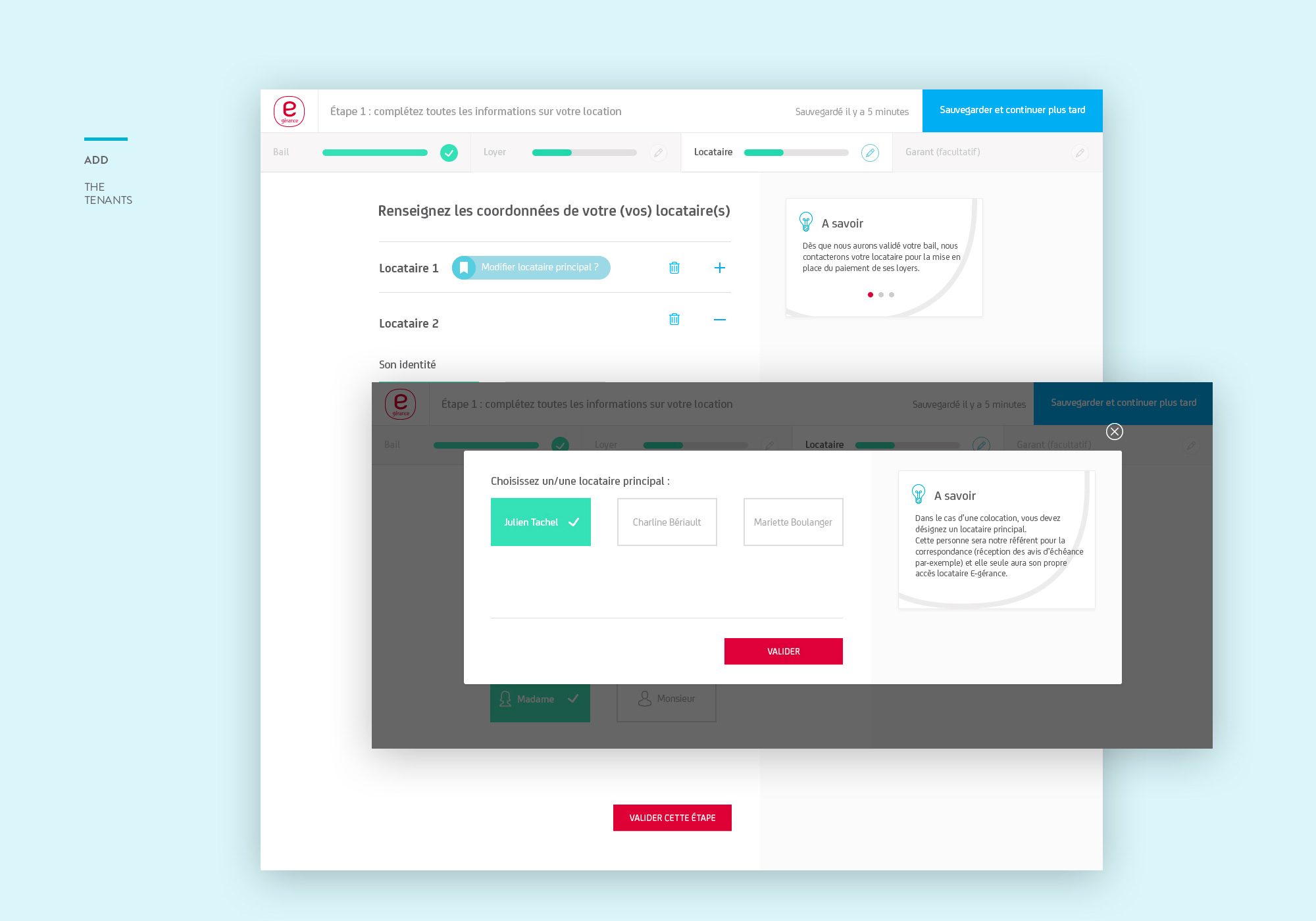
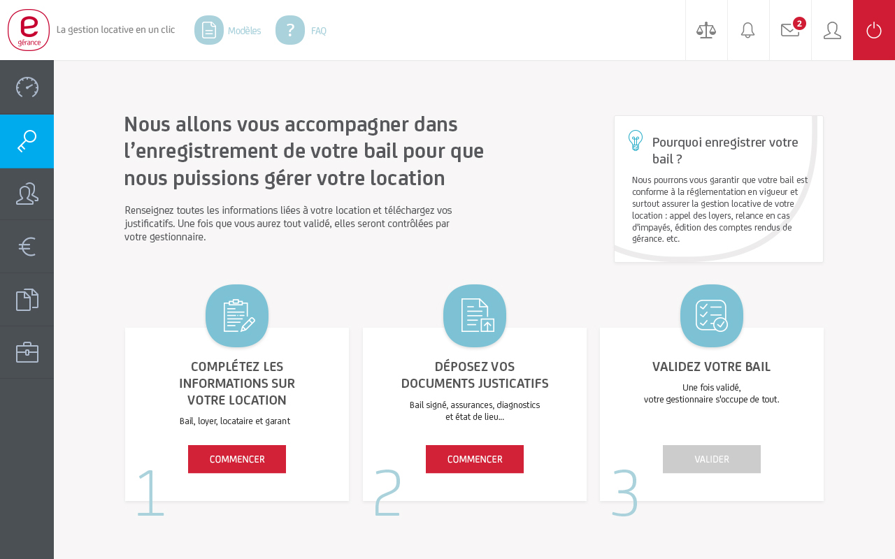
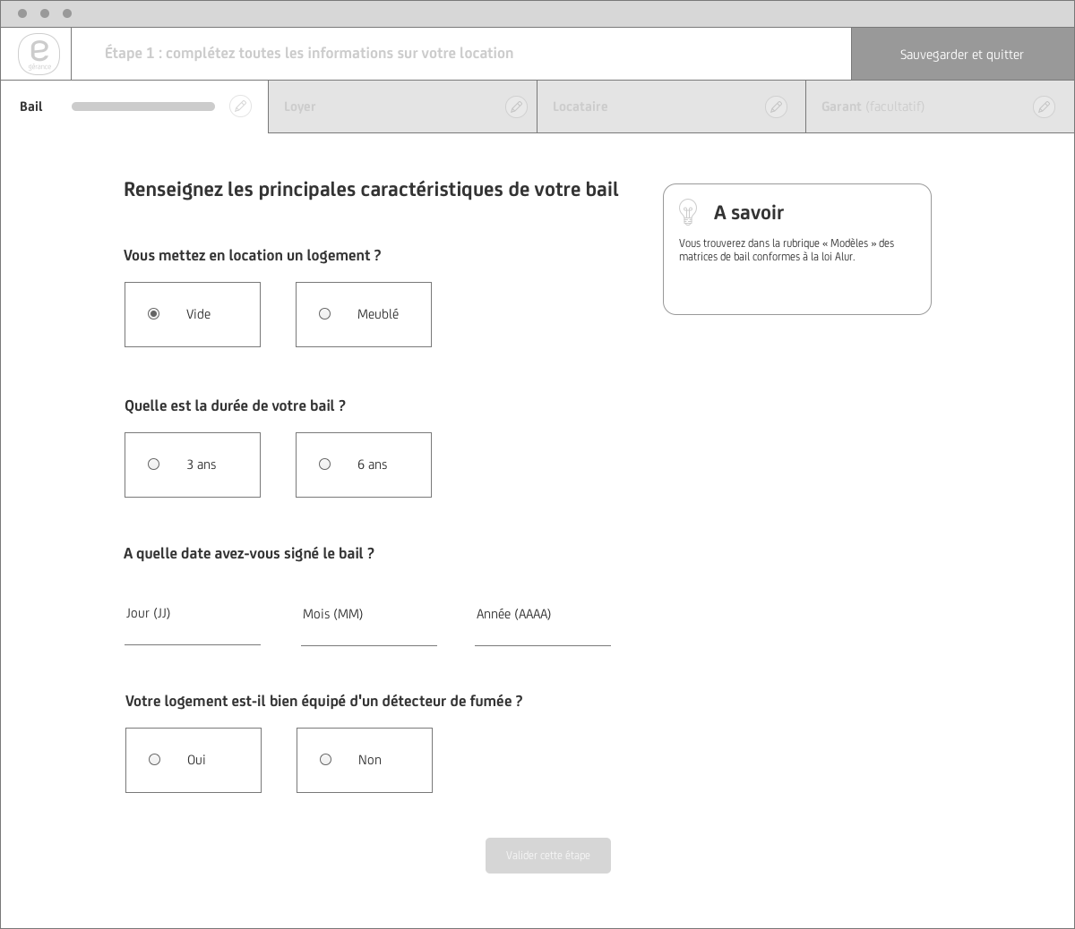
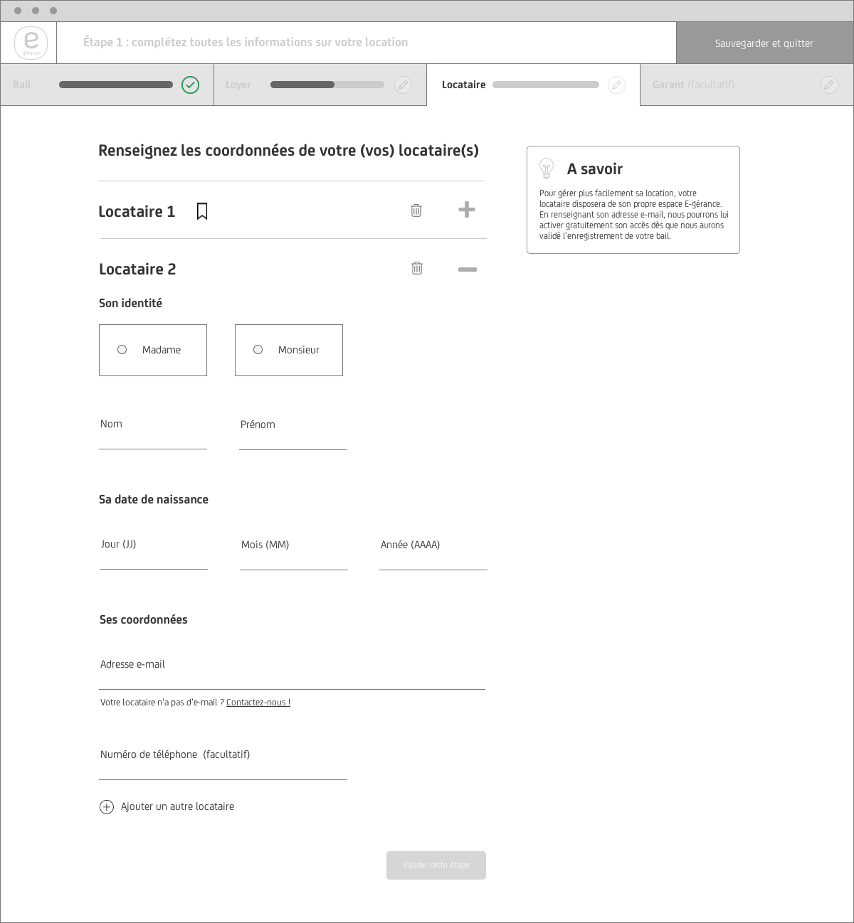
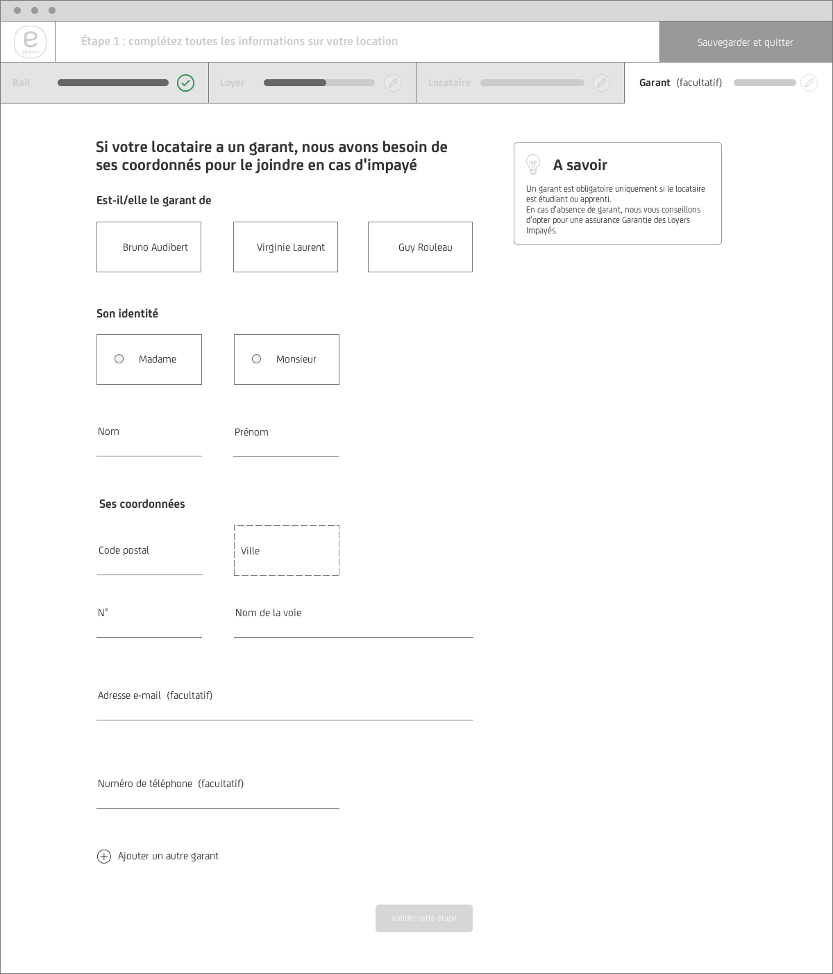
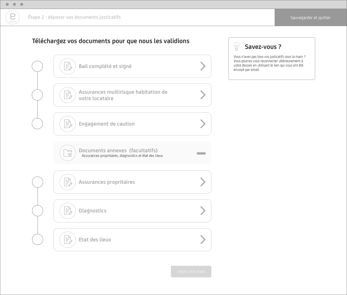
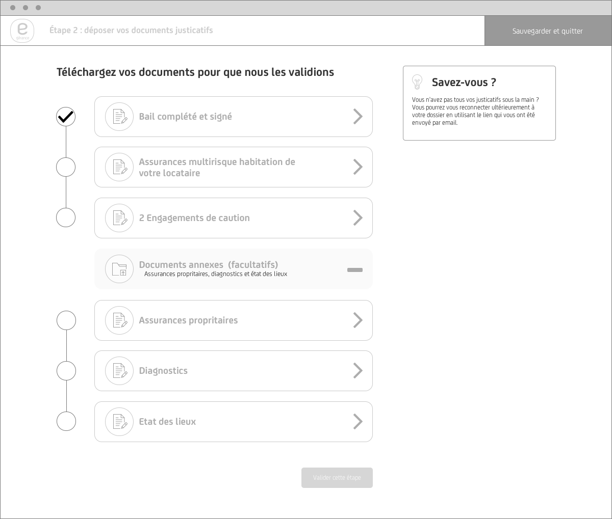
The updated RAR flow solves most of the problems gathered from the discovery phase with a much-improved UI. A clear sense of progress is created with a persistent nav that displays three new steps to the flow: Welcome, Information about the rental agreement(contract/rent/tenant/guarantor), and documents upload system. This gives the user a sense of context as they navigate through the entire flow.
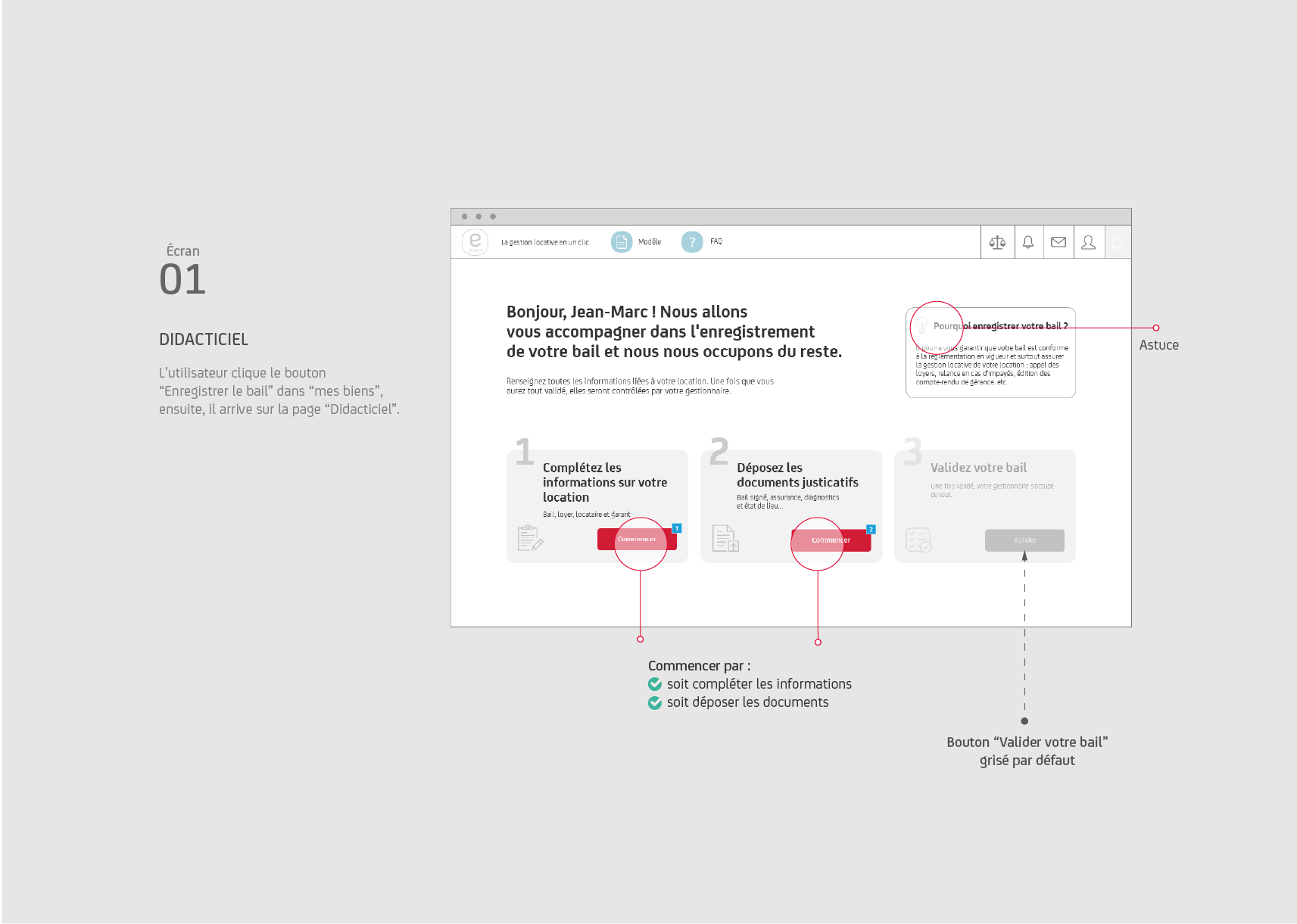
It displays as four tabs with progress bars:
Users can start whatever tabs they want and leave the process if needed (autosaved).
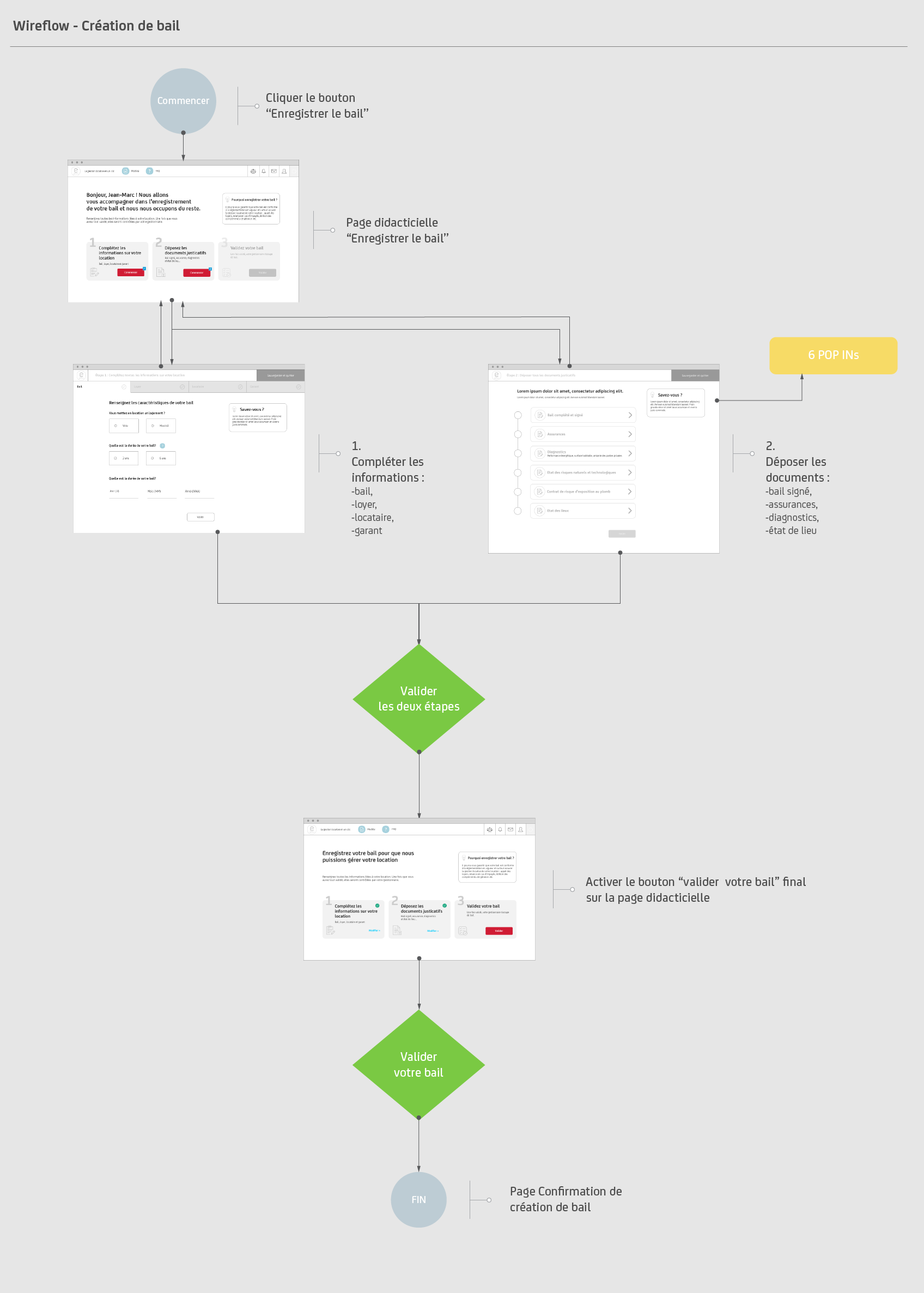
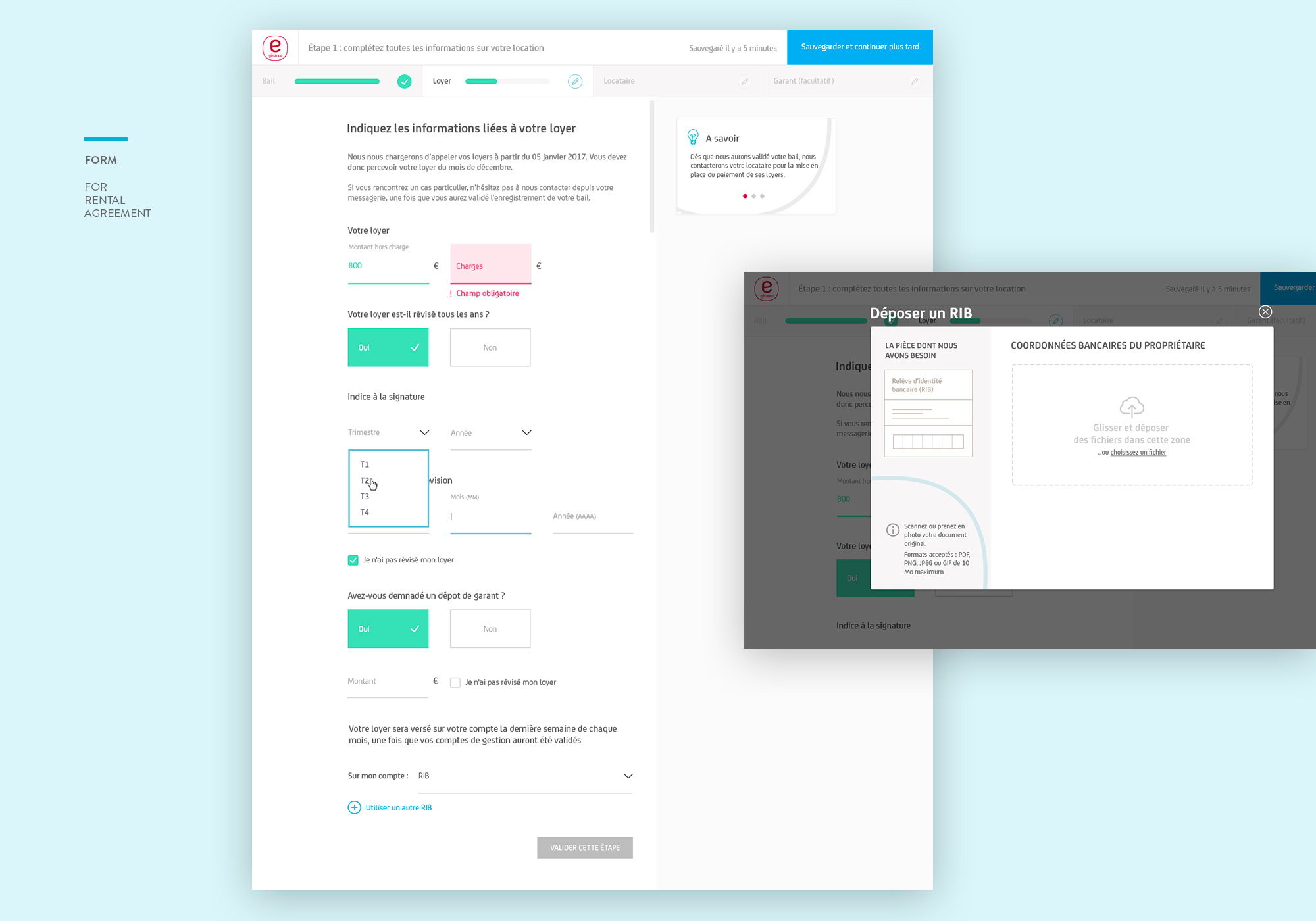
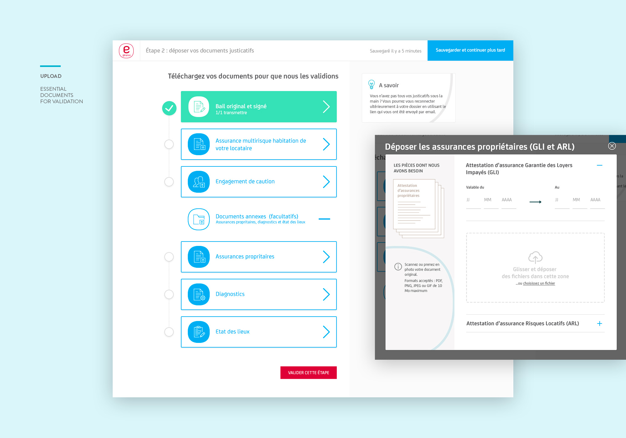
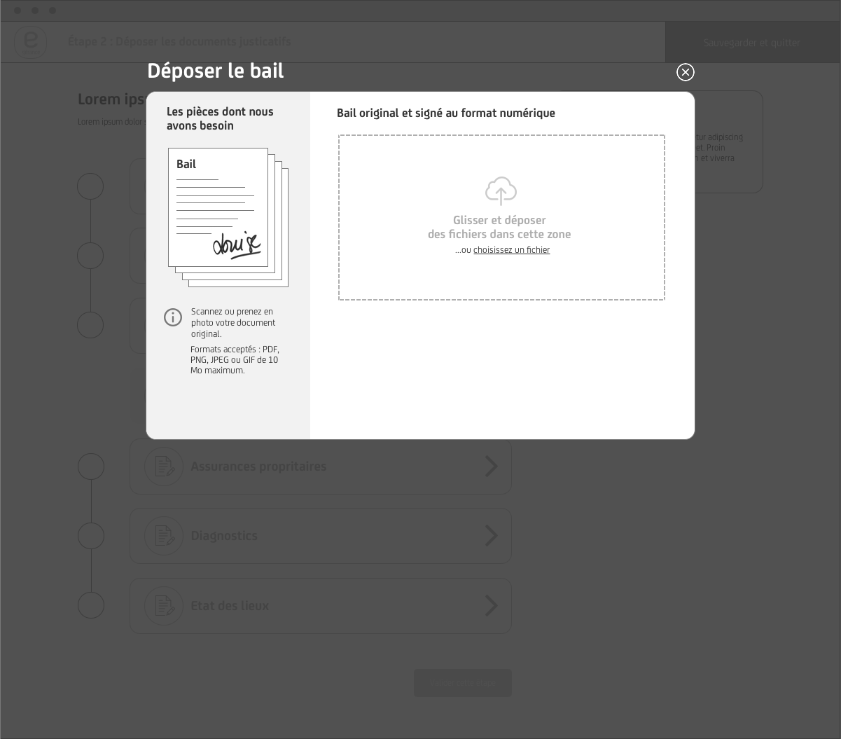
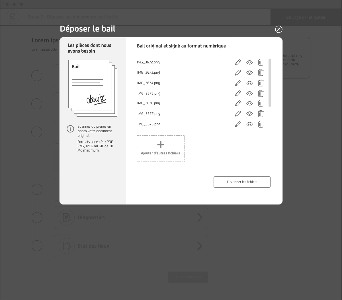
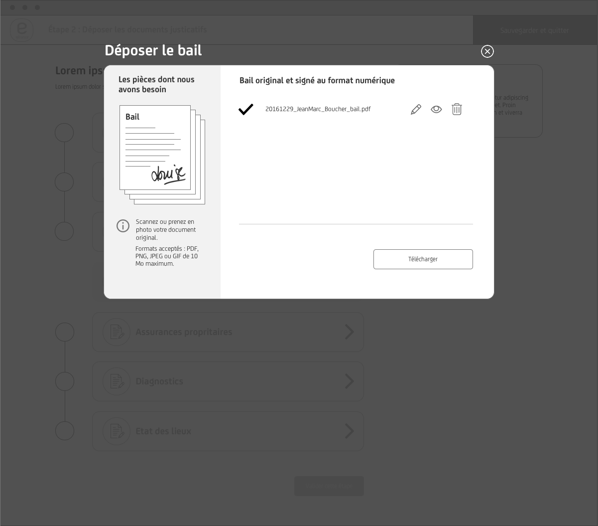
Step by step POPIN upload and edit process
I created almost all of the detailed screens in wireframe to communicate and iterate all the process with stakeholders (PM/Dev/Clients). Thus, at the visual design stage, the main Web/Mobile UI components styles were made to facilitate the implementation phase.
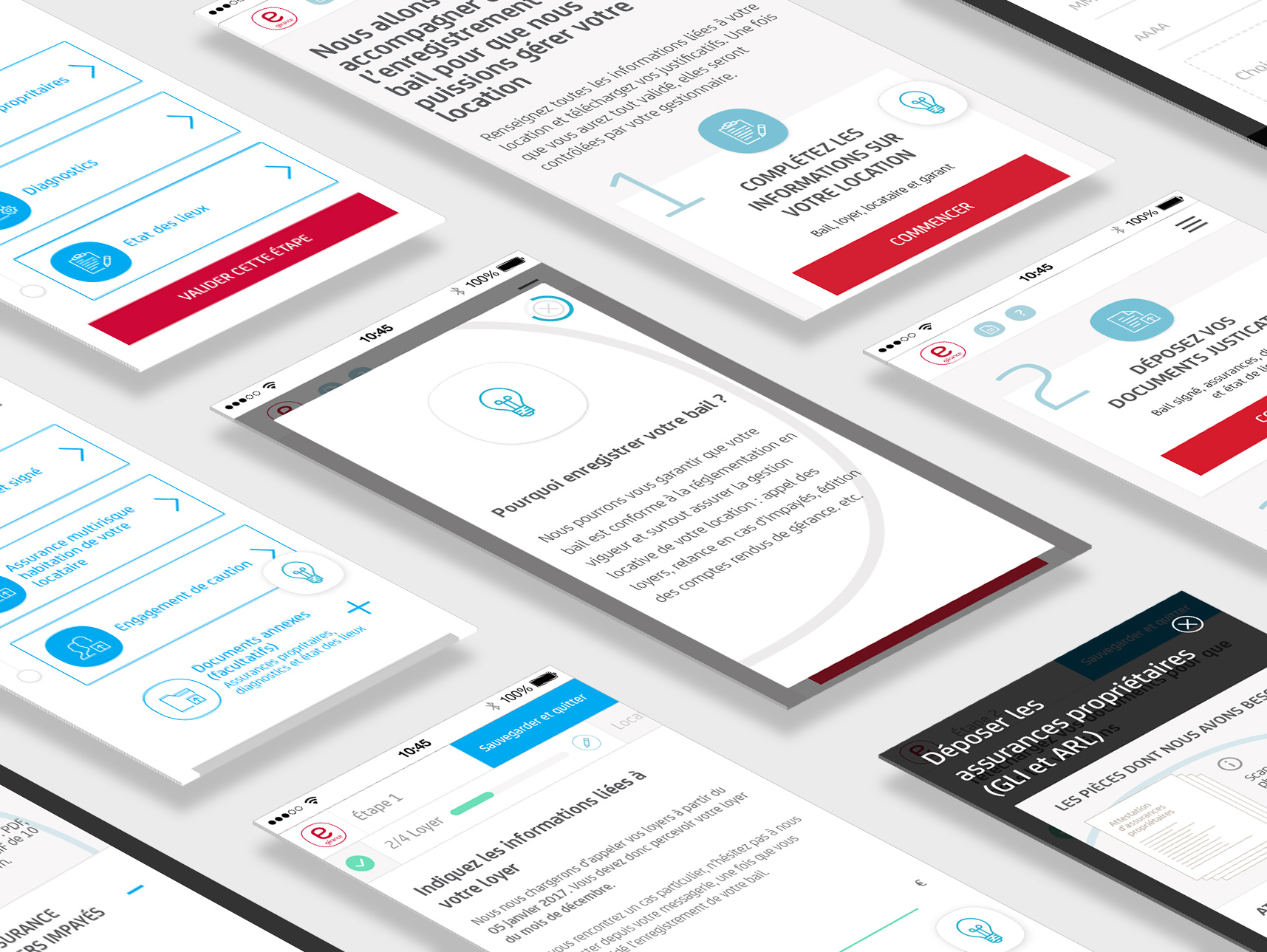
I created a mobile version of the desktop RAR flow. The initial ask was not a mobile-first experience, but rather a responsive desktop experience, with optimizations made for mobile users.
As you can see, the visual design of the interface and web form is flat and minimalist, so creating usability with micro-interactions that boost UX is becoming unavoidable.
After hand-over mockups/assets to front-end developers, I proposed some tips and showed them which real-time micro-interactions will support usability the best in this case, and accompany them to ensure the quality of the implementation.
Redesigning Rental Agreement registration flow is the priority for clients. It requires the complete reconsideration for the design and the backend development support. From the beginning, we worked closely with the lead developer to make sure the design is grounded with the feasible tech.
Through this project, we not only created the new minimal web form style with micro-interactions but also new clean and straightforward documents upload system for the whole site.
In the end, our clients are euphoric with the final result that we presented.
There are still two other issues to address:
I’ll discuss them in future case studies.


